
Perspective
Here’s how my blogs often go:
1) Writing about investing stuff isn’t for everyone, so I try to start off with an attention grabber so you’ll stick with me for a few minutes while I attempt to make a point.
2) Attempt to make the point.
3) End the blog with some kind of non-financial thing that helps us get recentered about what actually matters.
I have a few things to write about, but I saw something and now I have to change up this order and start with the non-financial thing.
While drinking coffee this morning, I stumbled on this note:

The note —written by a young boy in foster care— is a lot to take in.
”Clean bed with covers.”
”My own comb.”
”Toothbrush.”
When I arrived at my office, I printed this and put it on the wall next to my CFP® certificate.
Then, as I do every morning, I pulled up our client account interfaces at Schwab, Fidelity, and Altruist, and, much like the last couple weeks, I saw stock market declines across the board. Then I looked over at the freshly printed letter from this boy.
When the markets decline, our invested dollars can buy less stuff. But when we think about the stuff we want —or the stuff that matters— odds are these needs are easily met with a fraction of our investment portfolios.
Comparatively, a lot of the stuff on the boy’s list is free: “Don’t hit on me”, “Help with school”, “Love”, etc.
Gut punch.
But let me be clear: I’m not saying “hey, I know you’re worried about your money, but look at this kid who has it so much worse than you.” This isn’t that.
Instead, I’m trying to inject some sadness which may ultimately lead to gratitude just to see if it helps you navigate the day-to-day with a different perspective.
You see, time is an investor’s best friend (more time = better potential returns), so if highlighting something like this may help keep you in the game a little longer, that’s a win.
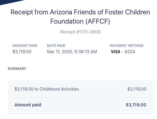
(One more thing… There are 3,119 of you who receive this blog in your inbox, so I donated $3,119 to the Arizona Friends of Foster Children Foundation in honor of you lending me your attention for a couple minutes on a Tuesday. Thanks for continuing to read and following along with us.)
Some other thoughts…
Okay, let’s move on to some additional tactics for thinking about your investments.
I wrote last week about how bonds and international stocks have provided a buffer to US-based stock market volatility — I still think that’s a smart discussion to unpack.
But another topic should be discussed. After all, yesterday was a very important anniversary:
On March 10, 2000, the tech-heavy NASDAQ index hit its market top before the Tech Bubble started to burst. Over the next 30 months the decline reached nearly 78%. See the chart below:

*Past performance not indicative of future performance.
The purple line is the NASDAQ index. The other two lines (blue and orange) represent the S&P 500 and the Dow Jones Industrial Average…. You can see how performance differed between these three US Stock indices.
Before we go forward, let’s do some quick math:
Let’s say you have $1,000,000 and it falls by 78% and you have $220,000 left. For this $220,000 to grow back to your original $1,000,000 you’d have to see about a 355% rate of return.
…Conversely, a 44% loss would need an 85% subsequent gain.
…And a 27% loss needs just a 37% rebound to break even.
Simply put, deep losses are incredibly hard to rebound from. Remember this when you’re chasing high flying returns.
There are a few reasons why performance differs between these three well-known indices, but none is more important than valuation, or the price investors are willing to pay relative to a company’s earnings or its book value.
When things are good, vibes are positive, and money is cheap, people will buy investments based on a good story even if the company doesn’t have much to show for itself today. When the vibes shift — as it did in the chart above — companies without significant assets or earnings are susceptible to big declines.
The NASDAQ of the late 90s and the year 2000 (and the NASDAQ of today, in many ways) was reliant on good vibes and stories of future growth (that term, “growth” is what advisors use to describe high relative price investments. “Value” is the converse.)
The Dow Jones Industrial Average, on the other hand, is not nearly as high-flying. The companies tend to trade at prices more representative of the reality of their business today rather than a story about what may come to fruition in the future. When the outlook for the future looks bleak, these companies may hold up a bit better.
Lastly, the S&P 500 is the most broadly diversified of the bunch, and represents a mix of both themes.
Here is the performance of each index thus far in 2025:

*Past performance not indicative of future performance.
As you’re going forward, I think it’s worth screening through the kinds of stocks you own to find out if you’re tilted more toward growth, value, or somewhere in the middle. There’s no “right” answer, but you should know how you’re postured. This is certainly something we focus on.
Okay, one final point…
Here is every 5% (or greater) decline in the S&P 500 since 2009.

When you look at the above chart, it makes our current decline seem almost normal, right? You could have wanted to sell so many times in the chart above. But you didn’t.
Remember that.
Adam Harding
CFP® | Lead @ Harding Wealth
www.hardingwealth.com
*For educational and informational purposes only. Not investment, tax, or legal advice.